Find your way around the office: Signs and wayfinding that create clarity

Find your way around the office: Signs and wayfinding that create clarity
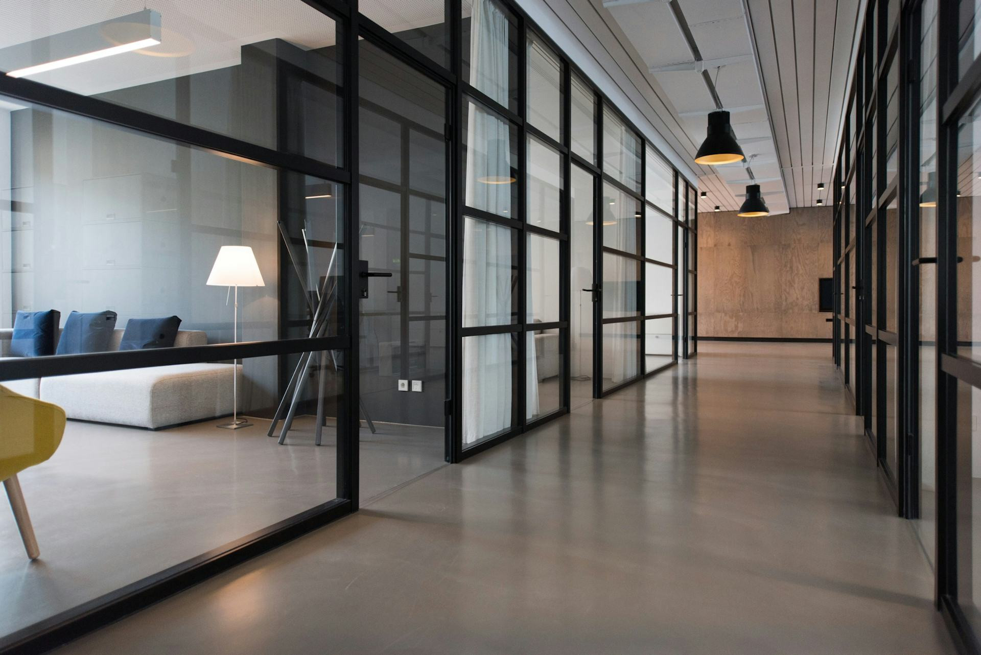
An office can easily feel like a maze – especially for new employees, visitors, or contractors stepping inside for the first time. Where’s the meeting room? How do you get to the kitchen? And which way leads to the printer? Clear signage and thoughtful wayfinding are the keys to an office where everyone can move around without confusion. It’s not just about looks – it’s about creating calm, efficiency, and a positive experience of the workplace.
Why wayfinding matters more than you think
Wayfinding – the art of helping people navigate a space – combines design, psychology, and practicality. When it works, you hardly notice it. When it doesn’t, frustration quickly sets in. Poor signage can lead to wasted time, misunderstandings, and even stress, while good wayfinding creates confidence and flow.
An office with clear visual communication signals professionalism and care. It shows that the organisation values both employees’ and visitors’ time. At the same time, signs and graphic elements can help express the company’s identity and values.
Læs også:
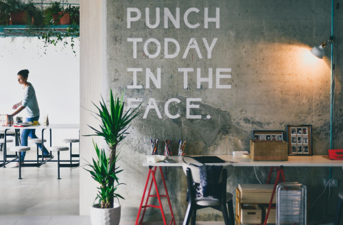
Signs that guide – not confuse
A good sign is more than just text on a wall. It should be easy to read, logically placed, and designed to fit the surroundings. Here are a few key principles:
- Clarity over creativity – choose a simple typeface and clear symbols. Too many decorative elements can make the message harder to read.
- Contrast and legibility – make sure text and background stand out from each other, and that the sign can be read from a distance.
- Consistency – use the same style, colours, and layout across all signs. This builds recognition and helps people orient themselves.
- Placement – signs should appear where people naturally look. A directional sign should be visible before a junction, not after it.
It’s often worth testing your signage with people unfamiliar with the office. They’ll quickly spot where the logic breaks down.
Colours, symbols, and zones
Colours and icons are powerful tools in wayfinding. Many workplaces divide their office into zones, each with its own colour or graphic marker. This makes it easier to remember where you’ve been and where you’re heading.
- Colour coding can mark departments, floors, or functions – for example, blue for meeting rooms, green for shared spaces, and orange for technical areas.
- Pictograms are especially helpful for visitors and international staff who may not speak the local language. A coffee cup says more than the word “kitchen.”
- Floor markings or wall graphics can complement signs and create an intuitive route through the building.
When colours and symbols are used consistently, they become part of the office’s visual language – and a daily help for everyone.
Digital wayfinding and flexible solutions
As offices become more flexible and people move between desks or meeting spaces throughout the day, digital solutions are gaining ground. Interactive screens, QR codes, and apps can show the way to available meeting rooms, printers, or colleagues.
Digital signs have the advantage of being easy to update when rooms change function or when temporary information is needed – for example, during events or renovations. They can also integrate with booking systems, so you can instantly see if a room is occupied.
But even with technology, the same principles apply: information should be simple, intuitive, and placed where users need it.
Signage as part of your brand identity
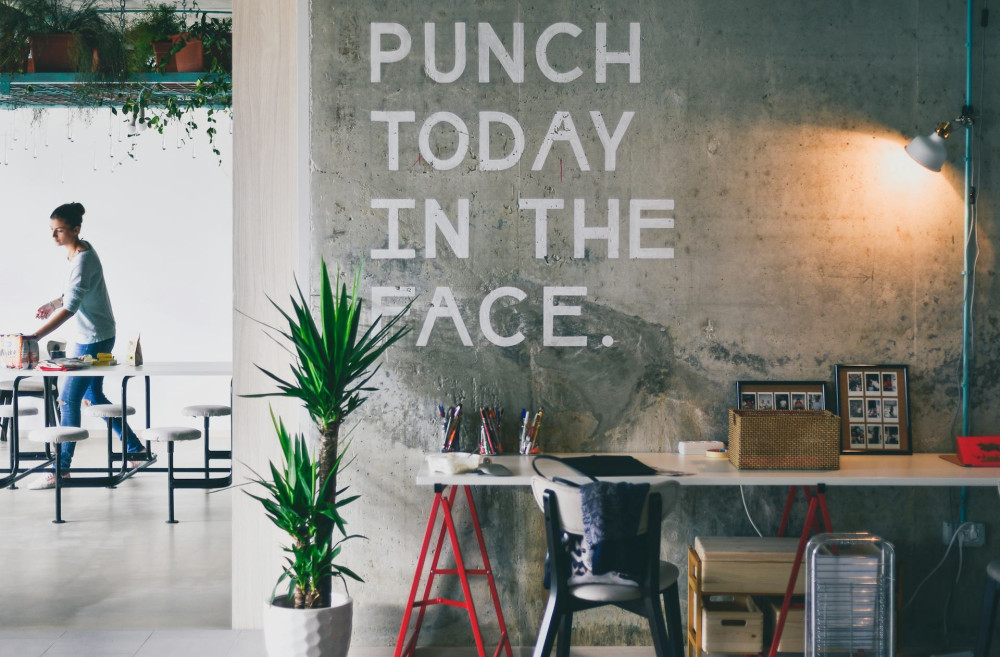
Signs and wayfinding are also an opportunity to express your company culture. A creative agency might choose playful graphics and bright colours, while a law firm may prefer a more understated and elegant look. The key is that the design reflects the organisation’s tone and values – without compromising functionality.
Consider how materials and finishes fit with the rest of the interior. Timber, metal, glass, or acrylic each create a different atmosphere. A cohesive design ties everything together and makes the office more welcoming.
An investment in wellbeing and efficiency
Good wayfinding isn’t just an aesthetic detail – it’s an investment in a well-functioning workplace. When employees and visitors can easily find their way, mental energy is freed up for what really matters: work and collaboration.
An office with clear, consistent signage feels more organised, more professional, and more inviting. It’s a place where people quickly feel at home – and that’s the best sign that your wayfinding works.
Læs også: